

How To Change The Axis Values In Excel Graph
 Please Note: This article is written for users of the following Microsoft Excel versions: 2007, 2010, 2013, 2016, 2019, and Excel in Office 365. If you are using an earlier version (Excel 2003 or earlier), this tip may not work for you. For a version of this tip written specifically for earlier versions of Excel, click here: Changing the Axis Scale.
Changing the Axis Scale
![]()
Excel includes an impressive graphing capability that can turn the dullest data into outstanding charts, complete with all sorts of whiz-bang do-dads to amaze your friends and confound your enemies. While Excel can automatically handle many of the mundane tasks associated with turning raw data into a chart, you may still want to change some elements of your chart.
For instance, you may want to change the scale Excel uses along an axis of your chart. (The scale automatically chosen by Excel may not represent the entire universe of possibilities you want conveyed in your chart.) You can change the scale used by Excel by following these steps in Excel 2007 or Excel 2010:
- Right-click on the axis whose scale you want to change. Excel displays a Context menu for the axis.
- Choose Format Axis from the Context menu. (If there is no Format Axis choice, then you did not right-click on an axis in step 1.) Excel displays the Format Axis dialog box.
- Make sure Axis Options is clicked at the left of the dialog box. (See Figure 1.)
- Adjust the scale settings (top of the dialog box—Minimum, Maximum, etc.) as desired.
- Click on OK.

Figure 1. The Axis Options of the Format Axis dialog box.
In Excel 2013 and later versions, the steps are different:
- Right-click on the axis whose scale you want to change. Excel displays a Context menu for the axis.
- Choose Format Axis from the Context menu. (If there is no Format Axis choice, then you did not right-click on an axis in step 1.) Excel displays the Format Axis task pane at the right side of the screen.
- Make sure Axis Options area is expanded. (Click on Axis Options and then the Axis Options icon.) (See Figure 2.)
- Adjust the Bounds and Units settings, as desired. These, along with a couple of other settings in the task pane, determine the scale used to display your chart.
- Close the Format Axis task pane.
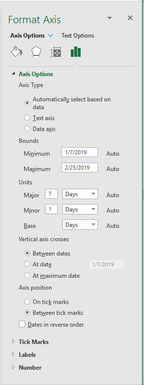
Figure 2. The Axis Options in the Format Axis task pane.
Note that in order to adjust the Bounds and Units settings, Excel needs to recognize the data in an axis as a range of values (e.g. dates). There will not be the option to change Bounds and Units if the data is recognized as discreet values by Excel (e.g. item names).
ExcelTips is your source for cost-effective Microsoft Excel training. This tip (9267) applies to Microsoft Excel 2007, 2010, 2013, 2016, 2019, and Excel in Office 365. You can find a version of this tip for the older menu interface of Excel here: Changing the Axis Scale.
Author Bio
With more than 50 non-fiction books and numerous magazine articles to his credit, Allen Wyatt is an internationally recognized author. He is president of Sharon Parq Associates, a computer and publishing services company. Learn more about Allen...
MORE FROM ALLEN
Easily Backing Up AutoText Entries
Many people use AutoText to enhance their use of Word. If you've invested significant time in customizing AutoText to ...
Discover More
Determining an Integer Value
When creating macros, you often need to process numbers in various ways. VBA allows you to convert a numeric value to an ...
Discover More
Removing the Last Digit in a Number
If you have a long numeric value in a cell, you may have a need to remove the last digit of that value. You can do so ...
Discover More
More ExcelTips (ribbon)
Changing Chart Types
Want to change an existing bar chart to a different type of chart, such as a line chart or a column chart? It's easy to ...
Discover More
Negatives in Pie Charts
Pie charts are a great way to graphically display some types of data. Displaying negative values is not so great in pie ...
Discover More
Using Go To to Jump to a Chart Sheet
Create a chart on its own worksheet, and you can display it by simply clicking the tab at the bottom of the Excel work ...
Discover More
How To Change The Axis Values In Excel Graph
Source: https://excelribbon.tips.net/T009267_Changing_the_Axis_Scale.html
Posted by: rossnalack.blogspot.com
0 Response to "How To Change The Axis Values In Excel Graph"
Post a Comment